what are our advantages
Easy startup and setup with AVSCMS and its efficient configuration features
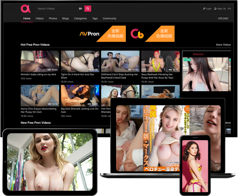
Videos
Create tube sites / communities where users can easily upload, host, share and watch adult and non-adult videos.
Photos
Create tube sites / communities where users can easily upload, host, share and browse adult and non-adult photo galleries.
Blogs
Create tube sites / communities where users can easily host and manage their own adult or non-adult (video) blogs.

Why AVSCMS
AVSCMS gives you complete end-to-end assistance and the best solution for your White label OTT platform.
HD & Mobile Videos
With our new Video Transcoding Engine, uploaded videos are converted to web-ready and mobile-ready formats in multiple resolutions and qualities, that you set and configure in the Admin Panel.
Multi-Server System
Our Multi-Server System provides high Scalability, Reliability and Performance to your website. Store and stream videos from multiple secondary servers, load balancing your website and optimizing traffic.
Search Engine Optimized
Our script implements advanced SEO techniques like search engine friendly URLs, clean valid HTML code, and well-organized content, for better indexing and ranking in search engines.
Responsive Template
Allow visitors to browse your site, watch and upload videos or photos, through a responsive interface that adapts for any screen, offering a perfect experience on desktops, laptops, tablets and smartphones.
Multi-Language System
Our Multi-Language System, which uses language files, allows visitors to use the website in the language of their choice. Your aspirations can now truly reflect the global nature of the Internet.
Fully Customizable
Unlike others, we provide 100% un-encrypted source-code access, giving you the possibility of fully customizing the functionality and layout of your website, adding or integrating new features.
Their Reviews On AVSCMS
Mike Felson / Webmaster
The best tube script in the adult industry. Period. It has all the features you will ever need including HD support and mobile / tablet interface. The support is fast and effective. They convinced me to purchase more licenses as well as some of their other scripts.